

Quiver0f10
-
Posts
9,015 -
Joined
-
Last visited
Content Type
Profiles
Forums
Events
Blogs
Classifieds
Store
Posts posted by Quiver0f10
-
-
We try to eat healthy, but I know we have a lot of room for improvement. How can I feed my family healthy and not go broke doing it?
-
We are just a few minutes into standardized testing and it's obvious that my 10 year old needs phonics review and vocab knowledge. We have used SWR in the past and are using LOE right now. She does ok with it, but she is having difficulty sounding out the multi-syllable words on her test. Vocab is a bust. What do you recommend?
-
Meatloaf, mashed potatoes and carrots
-
I can't find it if one has been posted. I'd love to see what others are planning this month.
-
-
I would combine as much as possible. SOTW with guide, Apologia science or library books on topics of their choice, WWE and FLL. I like Logic of English or Spell to Write and Read but those can be pricey. I'd probably try to find them used or use something like Spelling Workout. I like CLE or Saxon for math.
-
-
Whenever our internet connection is not steady we have trouble with VP. Maybe there isn't as large a buffer or the pings aren't coming back. Customer service has always been helpful and with the new version of the classes we are having less trouble. To get things moving I sometimes have to go back a slide or use the Table of Contents tab to restart the slide that we are using.
Thank you!
-
-
I am trying to decide on one of the VP SP courses but every time I try the demo it stops mid demo and I can't get it to reload. I have tried a few different courses, a few different times. Is it always like this? I don't want to spend money on a course if I am going to keep having trouble. We have high speed cable internet.
-
Pour a small amount of the liquid into your palm and use your fingers to apply it to your underarms. Let it dry completely before putting on your shirt (takes about 3 min.).
Thanks! I am going to try this.
-
Stupid question, but how do you apply it?Try it! :) My advice (and I think she mentions this in the blog post I linked too) is to wait a few minutes before putting on your shirt to let it dry. That way, you're guaranteed no mess. I haven't noticed any residue on my shirts at all - even when I don't let it dry completely. But it only takes about 3 minutes to dry, so it makes sense to wait.
-
I like Tom's of Maine.
I love Tom's of Maine.
-
Anyone have one to share? Thanks!
-
This room is huge so I don't want to paint it more than once LOLI'm the same way -- it's so hard for me to choose a color! I know everyone says, "It's just paint, and if you don't like it, you can paint a new color right over it," but painting is a PAIN, so I want to get it right the first time!!!
I usually like the paint colors at Restoration Hardware, because they're not too intense. I also like it that they don't have 900 colors to choose from.
http://www.restorati...=0&go.y=0&go=go
Most recently, we've been buying the Aura paint by Benjamin Moore because it has no odor, and also because it has amazing coverage and a very pretty finish, but the color choices can be pretty overwhelming (at least for me!)
-
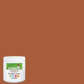
The darker orange doesn't seem as cheery and the lighter color, to me, is way too bright.
I don't think I would mind this orange. It does look peachy in the sun and darker in the shade. Still, it's very cheerful.

I really like that color, but my DH would not like it at all LOL
-
Orange is a hard color to choose. The bottom color will look like mustard on the wall, we did almost the same color in our previous classroom. We did a red accent wall. The red turned out great, the yellow, not so much. We called it the ketchup and mustard room until dh toned down the yellow.
Orange is difficult because it can look pink or muddy depending upon lighting. We did a pumpkin orange in ds's room when he was a kid, it was loud but great. You almost need to try a sample in the room to see how the light will play with it. I think you can go with a deeper tone that isn't so brown, but not so bright.
The bottom color does look like mustard in the dark so I just know I will hate it. Right now while it's sunny out it looks nice, but last night not so much.
-
Personally, I'd go with something more calming for a school room. Maybe it's just my kids, but I don't think they would concentrate well in an orange room. I would go with either a bright cool color or a fairly neutral shade of a warm color. I saw a nice school room the other day that was between sky blue and aqua with white trim and furniture. There were built-ins and a lot of windows, so there wasn't really much wall showing. It worked well.
Good point. Guess I am heading back to Lowes today LOL
-
I don't know if the colors are showing up accurately on my computer, but I don't love either color. One is too dark and the other is too bright. If I had to decide between the two of them, I'd go with the darker one, because I think I'd get very sick of the brighter one, very quickly.
Personally, I'd choose something a bit lighter and more neutral, but I'm kind of boring that way. (All I know is that whenever I choose a super-dark shade, it feels glamorous at first and then it's just sort of depressing, and the super-bright colors grate on my nerves after a little while.)
I think that's what my problem is , the dark is too dark and the lighter way too bright. So far I have 4 different sample spots painted in that room and I like none of them LOL
-
I have a Kindle Fire and love it! But I have been wanting a tablet with 4G and have been looking at the KF HD. Anyone have one and do you like it? What about a Surface Tablet?
-
I love the color you picked. We painted our living room Greenfield Pumpkin from Benjamin Moore. It is similar to your shade. Our house is for sale now and we have had several compliments on that room. I love how warm it feels and hope to use it again. We have gold and red accents. Oh, and our room has windows on three sides and is very bright.
I really like that too!
-
Thank you!This is fairly dark. You might first try a shade on the same card but several levels darker. Or do one wall in this and the others in the lighter version. You can see the color of my living room in my pic behind my son- BRIGHT green. The other side of the room is orange. The kitchen (opens into the living) is scandinavian blue. It's kind of like a toned-down Gobstopper set of colors. I only say all that to say, I'm not afraid of color! Your orange there just looks a bit dark to me.
My teaching studio is Caramel Sundae by Behr. It's a mild orange, kind of scan-design-ish.
http://www.homedepot...30#.UVT6yVtASwA
ETA: It looks less tan & more colorful in real life. Turquoise or scan blue accents look awesome.
-
I think I'm attaching a pic of the orange?
ETA - oops, guess not, trying from an iPad. I'll give it one more go ..
I'd love to see it!
-
I want to paint our school room. The room has a 18 foot ceiling and is 20X22. There are 4 windows so it gets a lot of sunlight. I really wanted to do a dark orange but now I am not so sure. I painted a sample square on one wall and I like it, but my oldest said that no one likes orange and that people will hate it. This is the color. .Opinions?
 The golden color below is the color she wants me to use and I just don't know. I think it's way too bright.:
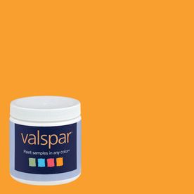
Large families on a budget-eating healthy?
in The Chat Board
Posted
.